Showcasing KPIs on Your Dashboard: A How-To Guide
- Data as a Service (DaaS) Software Marketing & Analytics

Showcasing KPIs on Your Dashboard: A How-To Guide
In the fast-paced world of business, staying on top of Key Performance Indicators (KPIs) is paramount. This guide explores the art of effectively showcasing KPIs on your dashboard, providing insights into what constitutes a good KPI-driven dashboard, the process, and introducing cutting-edge SaaS tools to make it seamless.
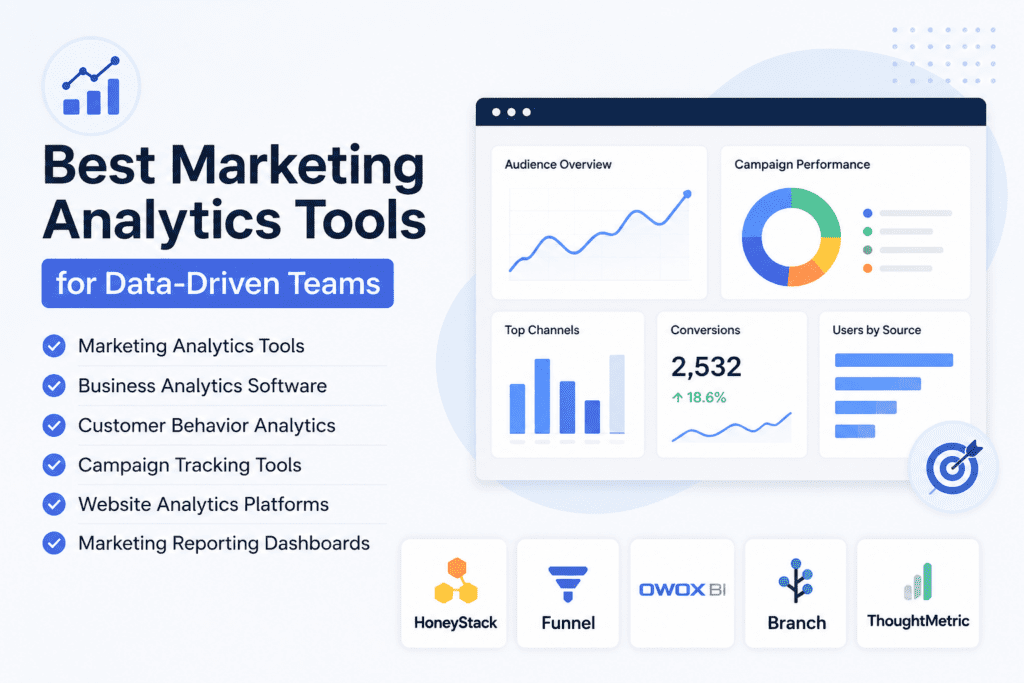
Crafting a KPI-Driven Dashboard
What Constitutes a Good KPI-Driven Dashboard?
A well-designed KPI-driven dashboard is more than just a collection of metrics. It’s a strategic tool that empowers decision-makers. Here are key elements:
- Relevance: Choose KPIs that align with your business objectives. Each metric should contribute to the overall goals, ensuring a focused and purposeful dashboard.
- Clarity: Keep it simple. A good dashboard communicates complex information in a clear and concise manner. Avoid clutter and unnecessary details that could dilute the impact of your KPIs.
- Interactivity: Enable users to interact with the data. Incorporate features that allow for drill-downs, filters, and real-time updates, fostering a dynamic and engaging user experience.
- Visual Appeal: Leverage visualizations effectively. Charts, graphs, and other visual elements should enhance understanding. Color coding and intuitive design contribute to a visually appealing dashboard.
- Timeliness: Ensure your dashboard reflects real-time or near-real-time data. Timely information empowers quick decision-making and keeps stakeholders informed about the latest developments.
Selected SaaS Tools for Crafting Your Dashboard
1. Tableau
Tableau stands out as a powerful data visualization tool, allowing businesses to create interactive and insightful dashboards. Its dynamic features enable users to present KPIs in a visually engaging manner.
2. Google Data Studio
Google Data Studio integrates seamlessly with other Google products, providing a collaborative platform for creating compelling dashboards. Businesses can showcase KPIs in real-time, fostering a data-driven culture.
3. Domo
Domo offers an all-in-one business intelligence solution, including dashboard creation. Its robust features enable businesses to present KPIs cohesively, ensuring a holistic view of performance metrics.
4. Power BI
Microsoft’s Power BI is a comprehensive analytics tool that excels in transforming data into insightful visuals. It is instrumental in creating dashboards that vividly portray KPIs, facilitating informed decision-making.
5. Klipfolio
Klipfolio specializes in dashboard creation and real-time data visualization. With a focus on simplicity and customization, it empowers businesses to showcase KPIs intuitively.
Conclusion
A good KPI-driven dashboard serves as a strategic tool that guides decision-making. By incorporating relevant KPIs, ensuring clarity, promoting interactivity, enhancing visual appeal, and providing timely information, businesses can craft dashboards that truly make an impact.
Elevate Your KPI Presentation with Subscribed.fyi
Maximize your KPI impact with Subscribed.fyi, the ultimate solution for managing your SaaS stack. Sign up for free today to unlock exclusive deals on 100+ SaaS tools, delivering savings exceeding $100,000 per year. Your gateway to optimizing performance is just a click away!
Supercharge your KPI dashboard now! Sign up for free and access exclusive deals on top SaaS tools with Subscribed.fyi.
Relevant Links: