Essential Tools for Basic Data Visualization in Various Applications
- Data as a Service (DaaS) Software Marketing & Analytics
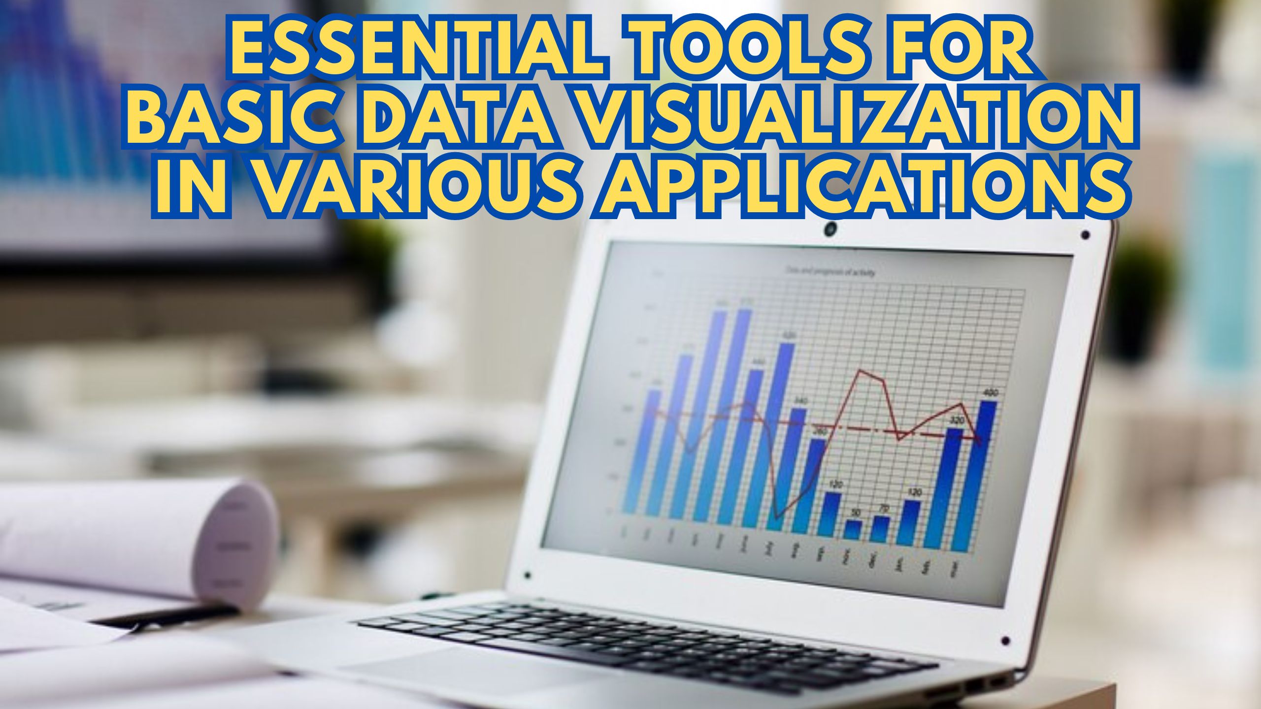
Essential Tools for Basic Data Visualization in Various Applications
In the dynamic landscape of data-driven decision-making, harnessing the power of basic data visualization tools is paramount. Whether you’re a seasoned analyst or a business owner, understanding the essentials is crucial. Let’s delve into the fundamental tools for data visualization that cater to diverse applications.
1. Google Charts: Simplicity in Web-Based Visualization
Google Charts stands out for its simplicity and versatility. It’s an excellent choice for web-based visualization, offering a variety of chart types. With straightforward integration and customization, Google Charts is relevant for those seeking ease of use in basic data representation.
2. Tableau Public: Interactive Visualizations for Everyone
For interactive and shareable visualizations, Tableau Public is an invaluable tool. It empowers users to create compelling charts and dashboards. Particularly relevant for individuals and small teams, Tableau Public democratizes data visualization.
3. Microsoft Excel: Widely Accessible Data Visualization
While primarily a spreadsheet tool, Microsoft Excel remains a powerful player in basic data visualization. With its charting capabilities and widespread use, Excel is relevant for businesses aiming for simplicity and familiarity in data representation.
4. Plotly: Python-Powered Interactive Visualizations
For those inclined towards programming, Plotly is a Python-powered library for creating interactive visualizations. It’s relevant for data scientists and analysts seeking to add a layer of interactivity to their visual representations.
5. Infogram: Infographics for Compelling Data Stories
Infogram specializes in turning data into engaging infographics and interactive charts. Relevant for content creators and marketers, Infogram adds a visual flair to data, making it accessible and compelling for a broader audience.
Conclusion: Navigating the Visualization Landscape
In the realm of basic data visualization, understanding the diverse tools available is crucial. Each tool caters to specific needs, from simplicity and accessibility to interactivity and customization. Choose the one that aligns with your goals and expertise.
Unlock Exclusive SaaS Deals on Subscribed.fyi!
Ready to explore a myriad of SaaS tools? Unlock exclusive deals on Subscribed.fyi and transform the way you manage your software subscriptions. Sign up for free today and embark on a journey of savings and efficiency.