Responsive Design Best Practices: 2024 Edition
- WebOps Platforms Bug Tracking & Feedback Software Web Development & Design
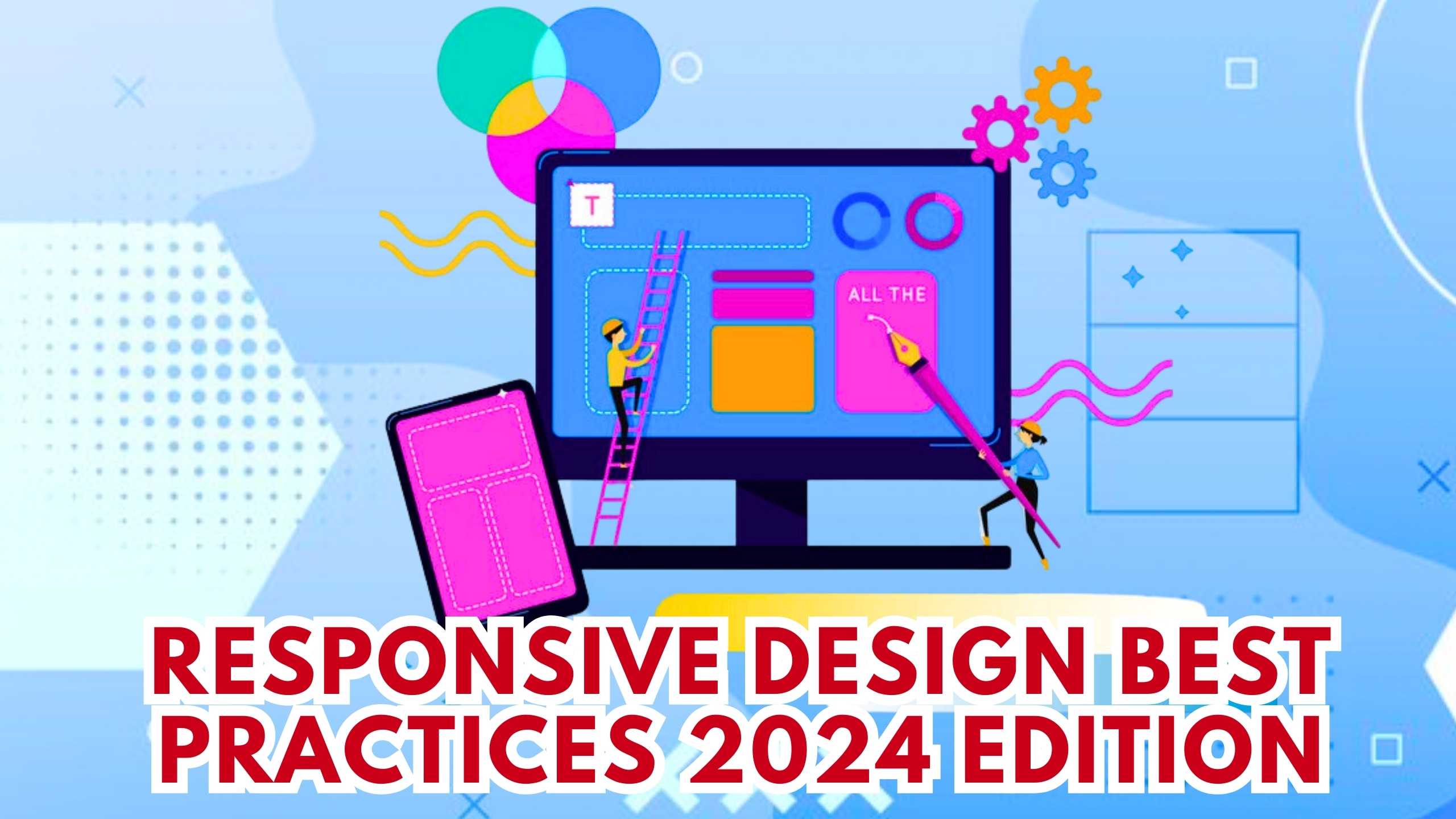
Responsive Design Best Practices: 2024 Edition
In the dynamic landscape of web development, Responsive Design continues to be a pivotal aspect of creating user-friendly and accessible websites. This blog explores the latest best practices in Responsive Design for 2024, addressing key considerations and strategies to ensure optimal user experiences across devices.
1. Mobile-First Approach: Prioritizing Small Screens
Embracing a Mobile-First approach remains a fundamental Responsive Design best practice. Designing for smaller screens first ensures that the core content and functionality are optimized for mobile users. Tools like Adobe XD provide a collaborative platform for designing and prototyping mobile-first experiences.
2. Flexible Grids and Layouts: Adapting to Various Screen Sizes
Implementing flexible grids and layouts is crucial for accommodating the diverse range of screen sizes in today’s devices. Figma offers a collaborative interface design platform with features like auto-layout that aids in creating designs that adapt seamlessly to different screen dimensions.
3. Media Queries: Tailoring Styles for Different Devices
Media queries play a key role in Responsive Design by allowing developers to apply specific styles based on device characteristics. Webflow is a no-code platform that enables the easy implementation of media queries, facilitating the creation of responsive designs without extensive coding.
4. Performance Optimization: Efficient Loading Across Devices
Considering performance is an integral part of Responsive Design. Tools like Pingdom assist in monitoring website performance, highlighting areas for improvement. Additionally, GTmetrix offers insights into page load times and suggests optimizations for a faster and more efficient website.
5. User Testing Across Devices: Ensuring Consistent Experiences
Conducting thorough user testing across a variety of devices is essential to identify and address potential issues. Platforms like UserTesting provide valuable insights by allowing you to observe how users interact with your website across different devices, ensuring a consistent and user-friendly experience.
Conclusion: Navigating the Responsive Design Landscape
As we navigate the ever-evolving landscape of web design, adopting Responsive Design best practices is paramount for delivering exceptional user experiences. From a Mobile-First approach to flexible layouts, media queries, performance optimization, and user testing, these strategies collectively contribute to a responsive and user-centric web presence.
Optimize Your Website with Subscribed.fyi
Ready to enhance your website’s responsiveness? Sign up for Subscribed.fyi to explore exclusive deals on SaaS tools tailored for web development. Unlock savings and streamline your subscription management, ensuring your toolkit aligns seamlessly with the latest Responsive Design best practices.
Relevant Links: