Responsive Web Design Techniques in 2023
- WebOps Platforms Bug Tracking & Feedback Software Web Development & Design
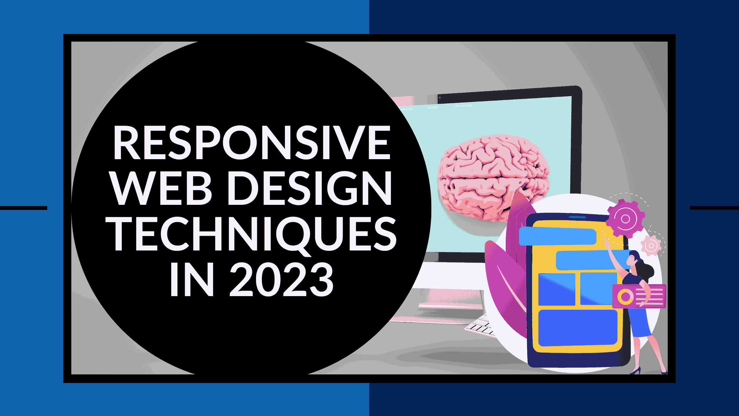
Responsive Web Design Techniques in 2023
What are the best responsive web design techniques? As the digital landscape continues to evolve, ensuring your website looks and functions seamlessly on various devices is more important than ever. With users accessing the internet through a multitude of devices, responsive web design is essential. In this article, we’ll explore seven essential techniques for creating responsive web designs that cater to users on any device in 2023.
Responsive web design has become crucial in 2023, and incorporating best practices is essential to stand out in this dynamic digital landscape. For more insights into responsive web development, you can check out these valuable resources:
- Best Practices for Responsive Web Development in 2023: Tips and Tricks
- Responsive Web Design Best Practices
- Insights on Responsive Web Design
- Responsive Web Design: What It Is and How to Use It
Now, let’s delve into the essential techniques that will help your website shine in the responsive design landscape.
1. Adopt a Mobile-First Approach
A mobile-first approach is a design philosophy that has gained significant traction in recent years as mobile devices have become the primary means of internet access. Starting with the smallest screens, like smartphones, this approach focuses on essential elements to ensure they are easily accessible on all devices. It allows gradual enhancement for larger screens without compromising usability or performance. By embracing a mobile-first approach, websites are both aesthetically pleasing and highly functional, offering a superior user experience to visitors.
2. Use Fluid Grids
Fluid grids are a fundamental element of responsive web design. They make your layout flexible, adapting to different screen sizes without losing structure. Relative units, such as percentages, ensure your design automatically adjusts to various screen sizes. This technique is crucial in today’s digital age, where users access websites on diverse devices. Fluid grids ensure your website looks great on any device, providing a seamless user experience.
3. Make Images and Media Flexible
To prevent images and media elements from breaking your layout or causing scrolling issues on smaller screens, it’s crucial to make them flexible. Use CSS properties like max-width, height: auto, and object-fit to ensure images scale proportionally and maintain their aspect ratio. Flexible images improve the user experience and can also boost website performance by reducing data transfer on smaller screens.
4. Prioritize Content and Navigation
Responsive design goes beyond resizing elements; it involves prioritizing content and functionality for different devices. Consider collapsing the navigation menu into a hamburger icon for smaller screens, preventing users from feeling overwhelmed. Use accordions or tabs to organize content, ensuring easy navigation. Emphasize key calls-to-action for a visually appealing and user-friendly website.
5. Typography and Readability
Typography and readability are essential for creating a user-friendly design. To maintain legibility across varying screen sizes, use relative units like em or rem for font sizes and line-height. Media queries can help adjust font sizes and spacing based on the screen size. Choose easily readable fonts, particularly for body text, and consider the contrast between text and background. Proper typography and readability enhance the user experience by ensuring text is legible and consistent across devices.
6. Optimize Performance
Website speed is crucial for a positive user experience. Users expect fast-loading websites, and optimizing performance is key. Techniques like compressing images, minifying CSS and JavaScript files, and implementing lazy loading can significantly improve your website’s speed. Compressed images reduce loading times, while minified files reduce the overall size of your website. Lazy loading ensures that only visible content is loaded, further enhancing the user experience.
7. Test and Iterate
No responsive design is complete without thorough testing on various devices and browsers. It’s essential to ensure your website is functional and visually appealing while being user-friendly. Tools like Firefox Inspector Tool, Chrome DevTools, and BrowserStack can help simulate different devices for testing. Real device testing can uncover issues that simulated testing may miss. Collecting user feedback on different devices ensures your design meets their needs.
Conclusion
In the rapidly evolving digital landscape, mastering responsive web design is imperative for delivering an exceptional user experience across diverse devices. The seven techniques discussed provide a comprehensive guide to ensure your website not only meets but exceeds user expectations in 2023. By adopting a mobile-first approach, utilizing fluid grids, and optimizing images, you set the foundation for a seamless and visually appealing design. Prioritizing content, fine-tuning typography, and optimizing performance further contribute to an enhanced user journey.
Remember, responsive design is an ongoing process, and testing across various devices is indispensable. Now that you’re equipped with these techniques, your website is poised to thrive in the ever-changing digital environment.
For continuous insights into optimizing your web presence and staying ahead in the digital game, explore Subscribed.FYI. Discover exclusive deals on top SaaS tools that can elevate your web design and development process at Subscribed.FYI Deals. Streamline your subscription stack and unlock savings for a more efficient and cost-effective web management experience.